
Typography
Typography is the art and technique of arranging type to make written language visually appealing, readable, and effective in communication. It involves the thoughtful selection of fonts, sizes, spacing, and alignment to create compelling designs.
Typography is the art and technique of arranging type to make written language legible, readable, and visually appealing. It involves choosing typefaces, adjusting letter spacing, line length, and line spacing, as well as arranging text on a page or screen. Typography plays a key role in design, branding, and communication by influencing how text is perceived and how a message is conveyed.
Why is Typography Important?
Typography is crucial because it affects both the function and aesthetics of written content. The importance of typography includes:
- Improved Readability: Good typography ensures that text is easy to read, making information accessible and improving user experience.
- Brand Identity: Typography plays a significant role in defining a brand’s personality. Consistent use of fonts, styles, and layouts helps to create a recognizable identity that resonates with the target audience.
- Visual Hierarchy: Typography helps create a visual hierarchy, guiding the reader’s attention to important information through the use of varying font sizes, weights, and styles.
- Emotional Impact: Different typefaces can evoke different emotions. For example, serif fonts often feel traditional and professional, while sans-serif fonts can convey a more modern or casual tone.
- Aesthetic Appeal: Well-chosen typography can elevate the visual impact of a design, making it more engaging and attractive to the audience.
What Elements Define Typography?
Several elements define typography and contribute to how it shapes the overall design:
1. Typeface
The typeface, or font family, refers to a set of characters that share a common design. Common typefaces include serif fonts (e.g., Times New Roman), sans-serif fonts (e.g., Helvetica), and display fonts (e.g., Impact). The choice of typeface sets the tone for the design and message being conveyed.
2. Font Weight
Font weight refers to the thickness of the characters. Weights range from light to bold, and varying the weight can help create emphasis, contrast, and hierarchy in the text.
3. Letter Spacing (Tracking)
Letter spacing, also known as tracking, is the amount of space between characters in a word or sentence. Adjusting the letter spacing can improve readability and aesthetic appeal, especially in larger text or headlines.
4. Line Spacing (Leading)
Line spacing, or leading, refers to the vertical distance between lines of text. Proper line spacing makes text easier to read by preventing it from feeling cramped and cluttered. Too little space can cause lines to overlap, while too much space can break the flow of the content.
5. Alignment
Text alignment refers to the positioning of text within a space. Common alignment options include left-aligned, right-aligned, centered, and justified text. The choice of alignment affects the flow of reading and the overall balance of the design.
6. Contrast
Contrast in typography refers to the differences between text elements, such as font size, weight, or color. High contrast helps make important elements stand out, while low contrast creates a more subtle, harmonious effect.
7. Text Hierarchy
Text hierarchy refers to the arrangement of text to indicate importance. It helps guide the reader’s attention by using different font sizes, weights, and styles to differentiate headings, subheadings, body text, and other elements.
How to Use Typography Effectively
To use typography effectively, consider the following best practices:
- Choose the Right Typeface: Select a typeface that aligns with your message and the tone of your brand. Serif fonts are often seen as more traditional, while sans-serif fonts are modern and clean.
- Create Contrast: Use font sizes, weights, and colors to create contrast and emphasize key information. This helps establish a clear visual hierarchy and guides the reader’s focus.
- Maintain Consistency: Keep font choices consistent across all materials. This helps build brand recognition and ensures a cohesive look throughout your designs.
- Ensure Readability: Prioritize legibility by choosing appropriate font sizes, line spacing, and contrast. Avoid overly decorative fonts for body text and ensure adequate spacing between characters and lines.
- Use White Space: Leave enough white space around text to give it room to breathe and enhance its readability. Crowded text can feel overwhelming and detract from the overall design.
- Consider the Context: Think about where the typography will be used—whether it’s for print, digital, or signage. Different mediums may require adjustments to ensure the text remains effective and readable.
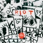
How RIOT Uses Typography
At RIOT, we consider typography to be an integral part of the design process. Our approach includes:
- Tailored Typography: We carefully select typefaces and adjust typography to align with our clients’ brand identities, ensuring that each project communicates its message clearly and effectively.
- Hierarchy and Readability: We use typography to create a clear visual hierarchy, ensuring that the most important information stands out while maintaining a seamless reading experience.
- Innovative Design: We explore creative typography to make designs unique and engaging, ensuring that the text itself becomes a design element that enhances the overall aesthetic.
- Cross-Platform Consistency: We ensure that typography is optimized for different platforms—whether print, digital, or social media—ensuring a consistent experience for the audience across all touchpoints.
Ready to elevate your design with impactful typography? Let’s create something remarkable together.
Final Thoughts
Typography is an essential tool in design that goes beyond just choosing fonts. It plays a critical role in enhancing readability, conveying messages, and creating a strong visual identity. When used effectively, typography can elevate the impact of any project, ensuring that the message is not only communicated clearly but also resonates with the audience.
Dive deeper
Color Scheme, Graphic Design, Visual Identity, Design, Branding