Coachtopia: Establishing a Brand Identity in Motion
Some projects come with tight brand guidelines. Others come with complete creative freedom. Our latest collaboration with Coachtopia landed firmly in the latter category—an open brief, a month-long creative sprint, and a simple yet exhilarating directive: create as many unique logo stings as possible.
But this wasn’t just about animating a logo. Instead, our task was to define the visual DNA of Coachtopia, Coach’s new sustainability-focused sub-brand. Our logo stings would be a core part of Coachtopia’s look and feel, appearing across films, social content, and campaigns for years to come. This was an opportunity to shape the future of the brand’s identity—and put the unmistakable RIOT stamp on it.
The Approach: A Logo for Every Moment
With total creative freedom, we approached this project with an expansive mindset. Each logo sting needed to be distinct—built for different moods, different placements, different types of content. Some were designed to open a film, others to close it. Some told a story in a single burst, while others were meant to be used in sequence, creating a bookend effect across multiple pieces of content.
In just one month, we crafted 21 wildly unique Coachtopia logo stings, each with its own personality. Some were hand-drawn and playful. Others were glitchy and chaotic. Some leaned into a retro, 90s-inspired energy, while others felt modern and sleek. We played with deep textures, vibrant colors, and unexpected motions—ensuring that no matter the vibe, Coachtopia had a logo sting to match.
Finalized Coachtopia Logo Stings
From the full set of 21, a select few were chosen as the official Coachtopia logo stings—each bringing a different energy and use case within the brand’s growing identity:
Clouds Part
A dreamy, atmospheric reveal where the Coachtopia logo emerges as clouds drift apart.
Cloud Hop
A playful cloud character runs over and bounces between the Coachtopia letters to complete it, bringing a sense of motion and energy.
Our Planet
A planetary, universe-expanding treatment of the logo, provided in multiple versions (with stars, without stars, in black and white).
Simple Wiggle
A minimal yet lively motion variation, available in white, black, and rainbow colorways.
Coachtopia World Start & End
A grand, cinematic motion piece designed to introduce and close Coachtopia’s biggest films.
Each of these stings will help define Coachtopia’s visual presence, ensuring consistency and personality across all its content.
Exploring the Cutting Room Floor
Not everything made the final cut, but some of the most experimental ideas helped shape the direction of the brand. Our team created an expansive collection of logo animations, each with its own unique energy. Even the ones that didn’t make the official selection played a role in refining Coachtopia’s aesthetic.
To celebrate that process, we’ve included the full presentation of all 21 logo stings below—because in the world of RIOT, **every idea pushes the next one forward**.
Watch one of the final logo stings in the player above, and explore the full collection below.
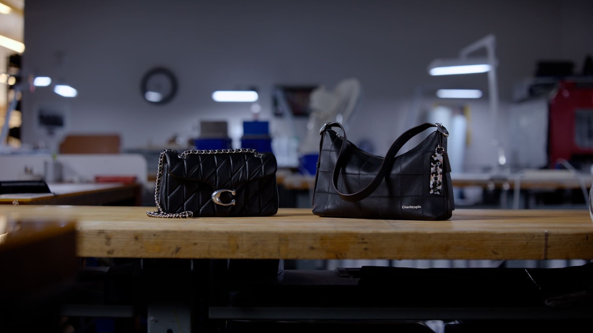
RIOT partnered with Coachtopia to bring sustainable luxury to life in the Alter/Ego collection. This visually captivating story, told with the charm of a nature documentary, turns leather scraps into iconic designs, reshaping the future of fashion with every stitch.
Explore the Project →

Coachtopia is Coach’s bold step into circular fashion—and RIOT was there to capture every moment. From sixteen sets to ten changemakers, see how we brought this campaign to life, featuring exclusive interviews with Lola Tung, Maya, Caulin, and the designers shaping the future.
Explore the Project →
Coachtopia needed a motion identity, and RIOT delivered. Tasked with creating unique logo stings for Coach’s new sustainability-focused brand, we designed 21 distinct animations—each bringing its own energy, personality, and purpose. Watch the final selections and explore our creative process.
Explore the Project →