LEADX: Brand Refresh
This wasn’t just about a logo; it was about carving out a unique space in a crowded landscape. We took a deep breath, rolled up our sleeves, and dove into the beautiful chaos of reinvention.
The Challenge of Identity
Two brands, one name. The task was clear: distance our LEADX from the other, without stripping away their soul. A delicate balance of originality and compliance, the work was an exploration of boundaries—both creative and legal. This was not a space for the faint-hearted; it was a space where design and diplomacy had to dance together.We knew we couldn’t just offer a tweak or a slight adjustment. This had to be bold, but still grounded. We laid out options that ranged from the subtle to the wild, presenting a spectrum of identities to gauge how far LEADX was willing to stretch.
Would LEADX leap into the unknown or keep their feet on familiar ground? The answer was somewhere beautifully in between.
Crafting the New LEADX
The process began where all great designs do: in a haze of ideas. We scribbled, we experimented, we toyed with numerous iterations until one felt alive. There was a rhythm we were chasing—a feeling that would resonate not only with LEADX's past but also with their future.Once we locked in the vibe, the aesthetic, we moved onto colors. Color is emotional, and it tells a story before words even hit the page. We played with palettes, tones, and shades, crafting options that would distinguish LEADX while amplifying its presence.
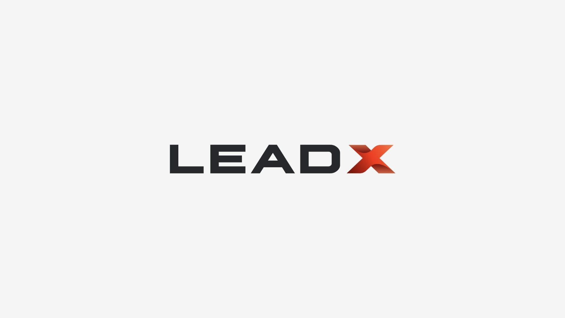
The official LEADX logo, featuring a bold red gradient "X," representing the brand’s refreshed and modern identity.
The logo—bold, refined, but never ordinary—was brought to life in Adobe Illustrator, with a brand guide polished and perfected in Canva. The colors came to us through a mixture of experimentation and gut instinct, each one selected with a deliberate nod to the brand’s evolution.
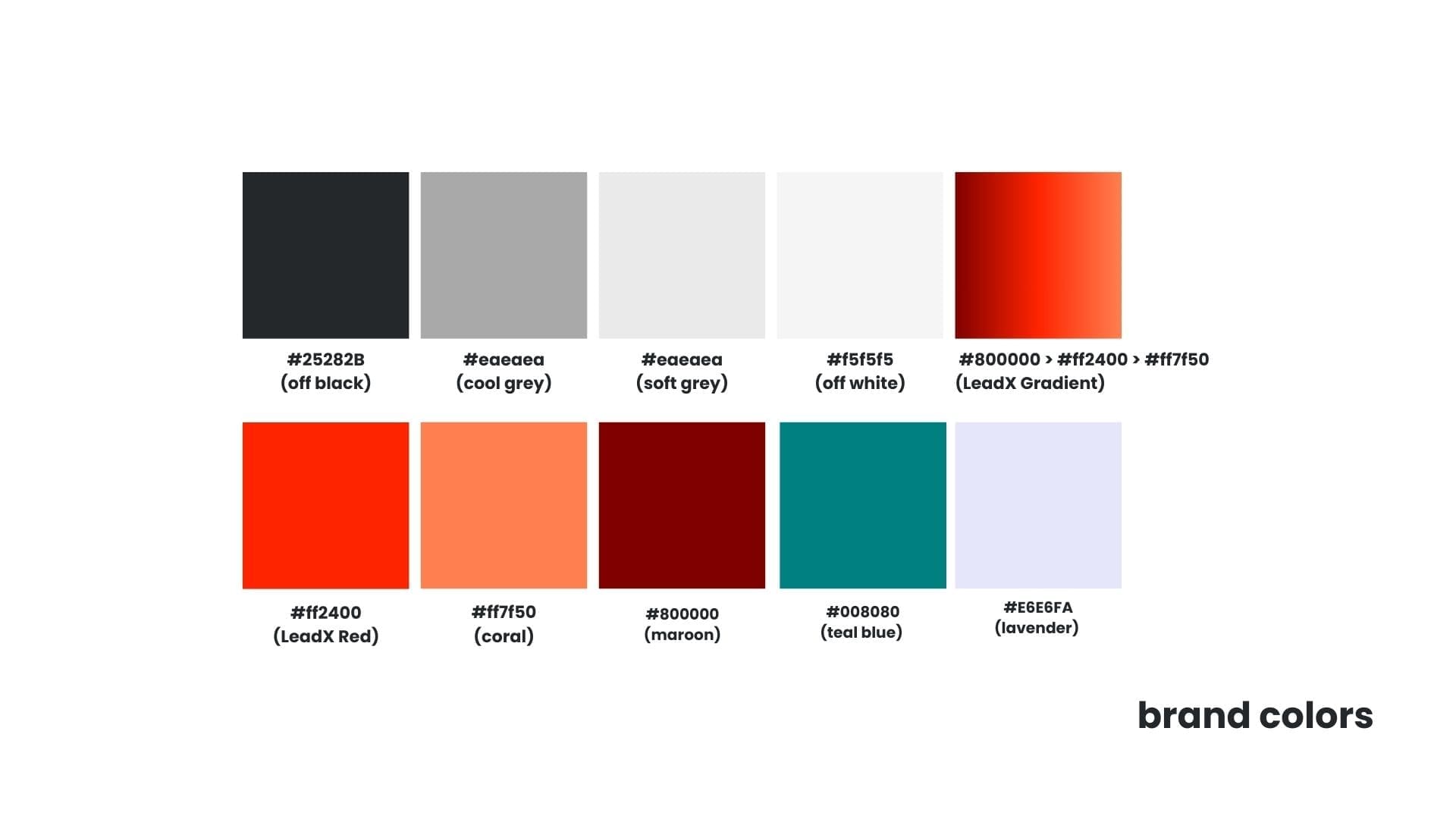
The official color scheme for LEADX’s rebrand, balancing bold reds with modern neutrals and playful accents.
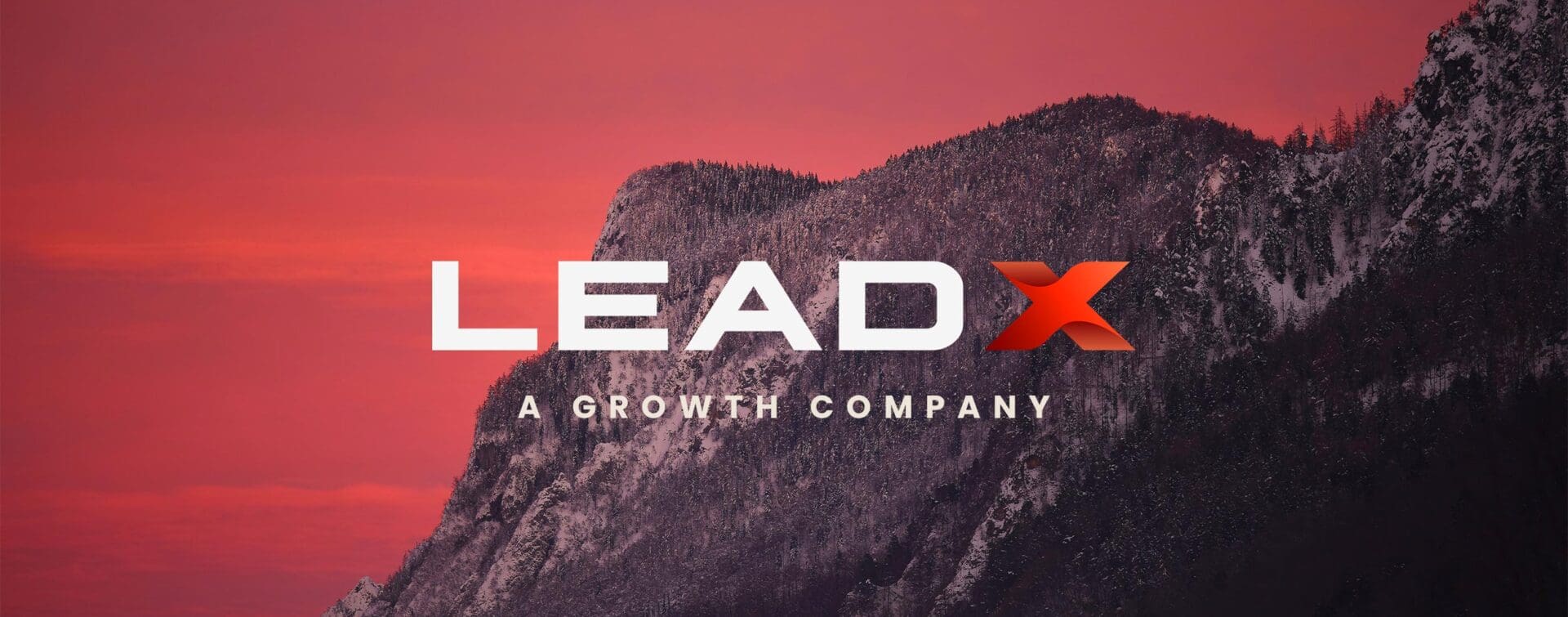
The slogan—simple, direct, yet undeniably impactful—was crafted to convey the essence of LEADX with precision. "A GROWTH COMPANY" captures the brand’s core mission in just three words, cutting through the noise to clearly define their focus. It was developed through a thoughtful process of distillation, where every word was carefully chosen to embody the company’s evolution and future aspirations. This slogan is more than just a tagline; it's a statement of intent that resonates with their commitment to growth and leadership in the industry.
The simple, yet impactful LEADX slogan "A Growth Company," capturing the essence of the brand’s mission.
The Outcome: Elevation in Every Sense
The final product? A sleek, elevated brand identity that separates LEADX from the crowd without losing an ounce of its original spirit. Our client felt the transformation deeply. This wasn’t just a logo refresh; it was a visual upgrade, a clear signal to the world that LEADX was stepping into its own.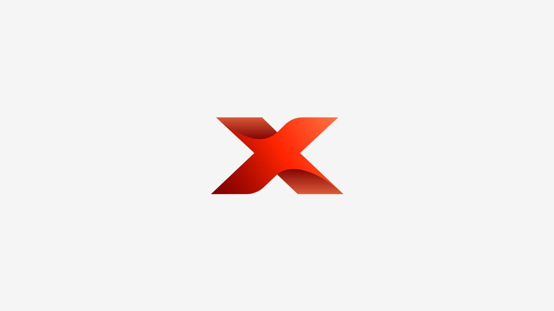
A close-up of the LEADX brand mark, featuring the bold red "X," to be used in various applications such as app icons, email signatures, and favicons.
The feedback? Glowing. The journey? Worth every twist and turn. We hope this rebrand becomes the foundation of something powerful—something that outlasts trends and resonates far beyond the initial launch.
In the end, this project wasn’t just about delivering a new brand identity. It was about proving that creativity doesn’t need endless space to breathe. It can thrive in the smallest of gaps, even in the face of restrictions and rules. We took the limitations and transformed them into opportunities, breathing life into a brand while navigating the tightrope of legality.
At RIOT, we live for these moments—when the impossible becomes possible and when boundaries are nothing more than starting points for imagination. LEADX’s brand refresh is proof that, with a little creative courage, anything can happen.
